-副本-scaled-1.png)
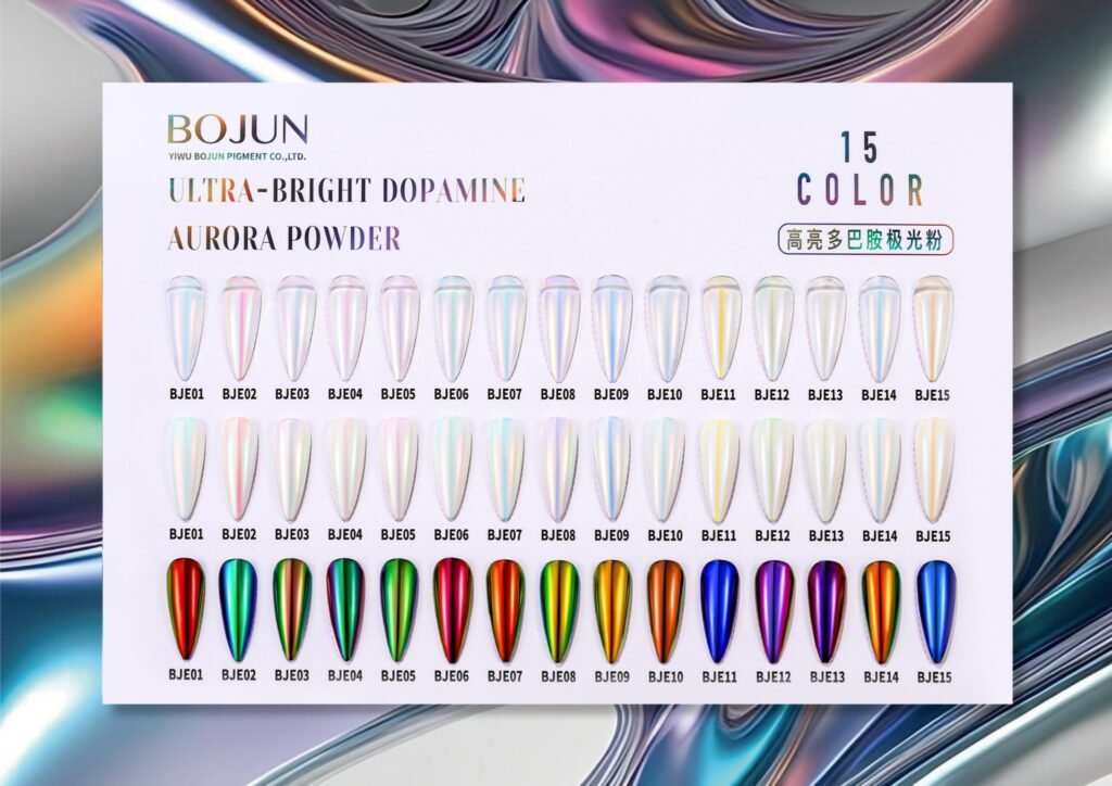
A beautiful effect earns its place in a collection when your team can explain what it adds to the colour underneath.
For nail-brand buyers and product developers, selecting a pearl or aurora pigment starts with a design decision: how much of the base shade should remain visible?
Your brief might call for a restrained highlight over a sheer nude, or a more noticeable colour shift over a deeper shade. Define that intention before comparing samples.
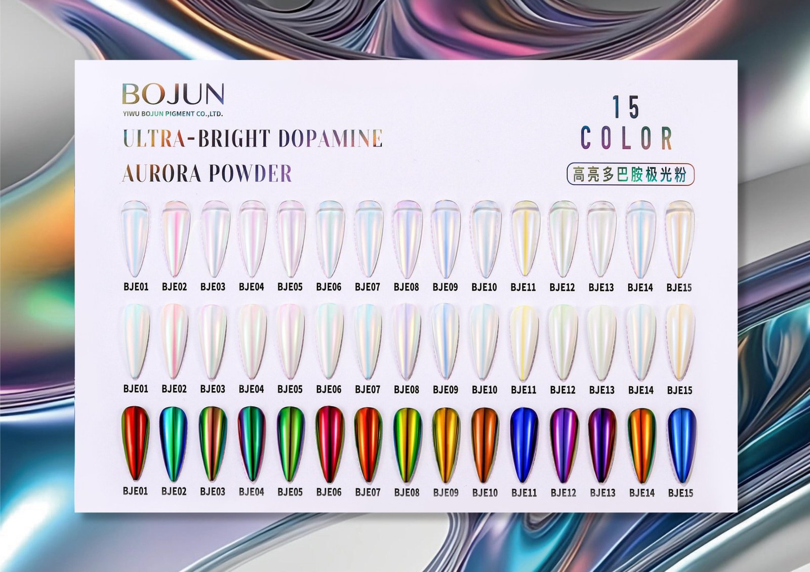
Build a small evaluation set using representative colours from your planned range. Keep the application method, viewing conditions and photography consistent, and record the pigment level or application amount used.
Then assess three points:
- Colour identity: Does the finished sample preserve the character of the base shade?
- Effect visibility: Is the highlight noticeable enough for the intended product concept?
- Collection fit: Does it add a distinct option beside the effects you already offer?
Review the samples from several angles, including in short videos. Evaluate suitability in the actual formulation, application process and top-coat system before making a product decision.
At Yiwu Bojun Pigment, I work with nail brands to turn visual references into focused pigment-sampling briefs. A reference image, intended application and a few target base shades give us a useful starting point.
For your next collection, are you looking to preserve the base colour or make the effect the focal point?
